

Spring is the perfect time to bring a touch of freshness and vitality to your home, and this year’s trend colors offer you endless possibilities for doing so. From pastel shades to bold hues, there are many ways to update the look of your home with this spring’s trend colors.
Let’s find out together what the most popular colors are for this spring and how to incorporate them into your decorating choices.
As every year, new and surprising trends make their way into the world of interior design to renew our idea of our home. Trends for spring-summer 2023 arise precisely from unprecedented color and material suggestions, to be matched according to your instincts.
Let yourself be captivated by our list of colors, patterns and accessories: you can opt for a total makeover or a little twist that will make every room look like new.
Let’s find out the trendy colors in interior design, the ones that will be most used in 2023.
If you are thinking about how to furnish your new home, or if you want to recreate it, these are the colors to focus on.
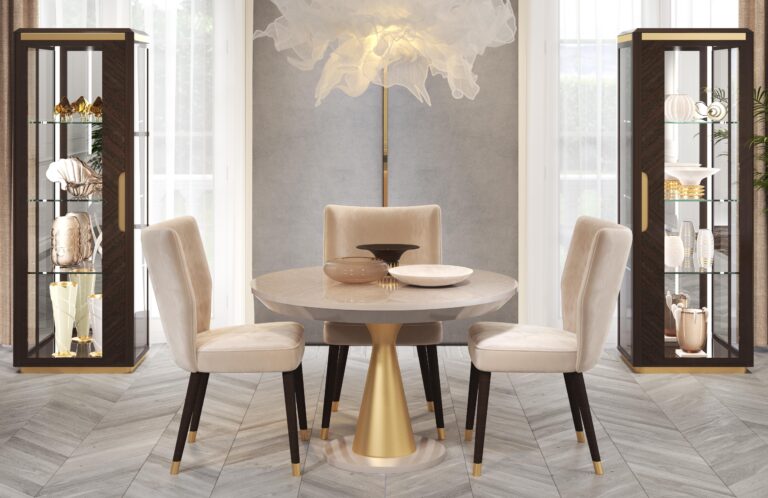
Mark these colors: taupe, gold and light blue. They are the ones you will see most in the furniture proposals and homes of 2023.
Endless dissertations could be made on why these colors are trending, but perhaps there is a simpler explanation: because they are beautiful colors that look great in home decor.
Let’s see them one by one, and how to use them:
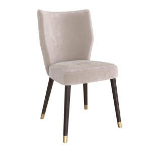
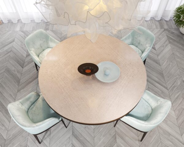
Taupe
Why it appeals
Because it gives a sense of warmth and coziness, because it is elegant, and because it goes with everything.
How to use it
Taupe, with its nuances that turn to gray, beige to cream, can be the common thread of an entire room, even the entire apartment, from floors to furniture to walls.
Its ease in combinations with light blue, camel and gray makes it possible to play with the colors of the various elements that make up a room.

Gold
Why it appeals
This color has always represented light, power and wealth. It is reminiscent of the sun and therefore transmits a sense of warmth and strength.
Moreover, it is the color that has been used since ancient times as a symbol of wealth and prosperity and nowadays chosen as a glam proposal for interior design.
How to use it
The choice of gold in interior design has only one rule to follow: less is more. One must avoid a tacky and unglamorous result! The choice of gold color can involve small furnishings such as mirrors, frames, pictures, knick-knacks, coffee tables or dining tables. This choice, if well dosed, will allow you to have a sparkling, bright and delicate home design.

Light Blue
Why it appeals
The color light blue is characterized by its extreme versatility, both for painting the walls of the house and for the choice of certain elements and furnishings, proving to be a color that is pleasing to the eye as well as easily combined with other colors.
How to use it
Light blue is contrasted with red. Its influence leads to a reduction in blood pressure and a deceleration of heartbeats and breathing. For this reason, blue is also used in color therapy to make people forget stress and relieve anxiety and insomnia problems. A calming and refreshing effect suitable for living room, dining room, and sleeping area.
Furnishing one’s home in an original way requires care and attention. However, there are some guidelines to follow that can simplify this operation. Guerra Vanni’s selection allows you to choose from a wide range of solutions, allowing you to find the one that best suits your personality and the latest trends.
Check out Guerra Vanni’s classic or contemporary sections and furnish your home in a unique way. Please feel free to contact us for more information.